

The logo Sengkang Town Council (SKTC) picked out of the 419 submissions it received in a recently-held logo design contest has won praise online for being visually appealing while still reflecting iconic features of the new town.
The town council, which was formed by the Workers’ Party (WP) after it won the GRC in the July elections, organised a logo design competition a number of weeks ago and sought logo designs that “reflect the character of Sengkang town and the values of the Workers’ Party”.
SKTC said that the winning designer would win a S$500 cash prize and an optional mentorship with BLACK creative designer Jackson Tan, and kept the contest open only to Singaporean students aged 13 and above.
The contest received a good response and 419 entries were sent to SKTC for deliberation. After over a month, SKTC has chosen to base its town council logo on an entry submitted by Kelly Hah.
Revealing that Kelly’s logo was tweaked with the input of Jackson Tan and his team of designers at creative agency BLACK, SKTC said on Facebook on Friday (23 Oct): “We sincerely thank every participant for sharing with us your wonderful ideas and we congratulate Kelly for winning the competition! Our team chose this logo as we felt it best reflected the character of Sengkang Town and the values of the WP.”
The winning entry features three blocks of flats against an orange sun. A green leaf is prominently placed in the foreground to represent the greenery in the town, alongside light blue waves which seem to depict the body of water that runs along Sengkang Riverside Park.
The final logo design also features another design element that was not present in Kelly’s original design – a light blue heart-shaped element that makes the waves look like the iconic whale at the Sengkang Sculpture Park.
SKTC said that Kelly “drew inspiration from Sengkang’s natural and built environments” and that the elements in her logo were bonded together within a circle “to reflect the spirit of an inclusive and liveable community in Sengkang.”
The town council added: “We hope that the logo represents, as Kelly aptly put it, “Sengkang Town – an inspiring and caring home for all generations, and where our dreams can be fulfilled.””
SKTC’s post drew close to 3,000 likes while the WP’s official Facebook page garnered another 3,200 reactions when it re-posted the logo on its page.
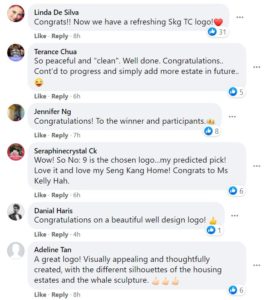
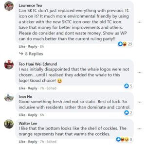
Netizens commenting on the logo praised the designer for creating a visually appealing logo filled with so much meaning. Several netizens congratulated Kelly while some even made a reference to Sengkang GRC MP Jamus Lim’s “cockles of my heart” remark and quipped that the waves look like the shells of cockles:

https://www.facebook.com/WPSengkang/posts/3536117843113012?__cft__[0]=AZWXcY5RTuT_SFKUbGi4gU0U1Llmmfq1AobOUqbHZYLRZZrMazsmZJtzwxlMa0NKq8rUKO9jIgp5vSriVSiQdh3j-Sa-JQBkcW6Nhh2R8lXLd3f-hvBRHS0oUUcK7DJ0WbBAEKk82KB1v_7nH1jEqxaKDg8UcYm2CJtFZbUKtLW6GzI8BMIGO1wPMvyGMq1SXNs&__tn__=%2CO%2CP-R
Sengkang Town Council competition: Logo by ineligible designer trends online
Pritam Singh joins new WP MPs at Sengkang GRC outreach event